

Why Your Landing Page Isn’t Working (And How to Fix It)
12 mistakes you can fix to improve your conversion rate.

You built a landing page. You sent the emails. You ran the ads. But conversions?
🦗🦗🦗 (Crickets).
Before you scrap the whole thing, take a breath. Most landing pages don’t fail because you didn’t try hard enough. They fail because of small but critical mistakes that destroy trust, clarity, or momentum.
Today, I’ll break down the most common landing page problems and show you exactly how to fix them, step by step.
12 Common Mistakes Destroying Your Conversion Rate (And How to Fix Them)
Most landing pages look fine at first glance. But when you peel back the layers, you find subtle (and often silent) conversion killers hiding in plain sight.
Today, I’m sharing the twelve most common mistakes (backed by research) and how to fix them. These are the usual suspects! If you’re struggling with your conversion rate, chances are high that it’s due to one of these issues.
1. Weak or Vague Headlines
The Problem: Your headline is the first thing visitors see. It has to earn their attention in seconds. If it's generic ("Welcome to Our Site") or unclear ("Empowering Business Transformation Through Innovative Synergies"), people tune out.
The Fix: A great headline answers the question: What am I getting and why should I care? Make it clear, specific, and benefit-driven. Think: "Get 50% More Leads Without Changing Your Ad Budget."
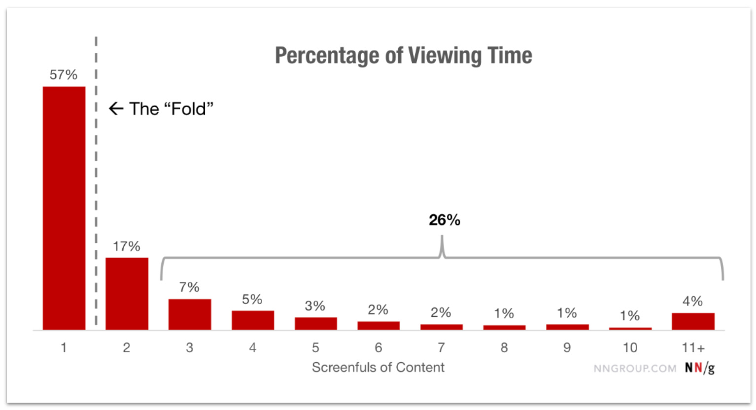
Related Research: A study by Nielsen Norman Group found that 57% of viewing takes place above “the fold”.1 The fold defines the point at which a user needs to scroll to see more of the page. Your headline, which should be situated above the fold, is your best chance to hook your audience. Make it count.
Example: Instead of "Optimize Your Workflow," try "Save 10+ Hours a Week With Our AI-Powered Project Manager."
2. Too Much Text, Not Enough Clarity
The Problem: Most people skim online. Long blocks of text feel overwhelming and hide the value. Rambling or jargon-filled language makes your offer harder to understand.
The Fix: Break things up. Use short paragraphs, bold key points, and add bullet lists to highlight benefits. Strip your copy down to the essentials. Imagine you only had 10 seconds to explain why someone should care: What would you say?
Related Research: A study by Nielsen Norman Group found that scannable, concise, and objective content improved usability by 124%.2
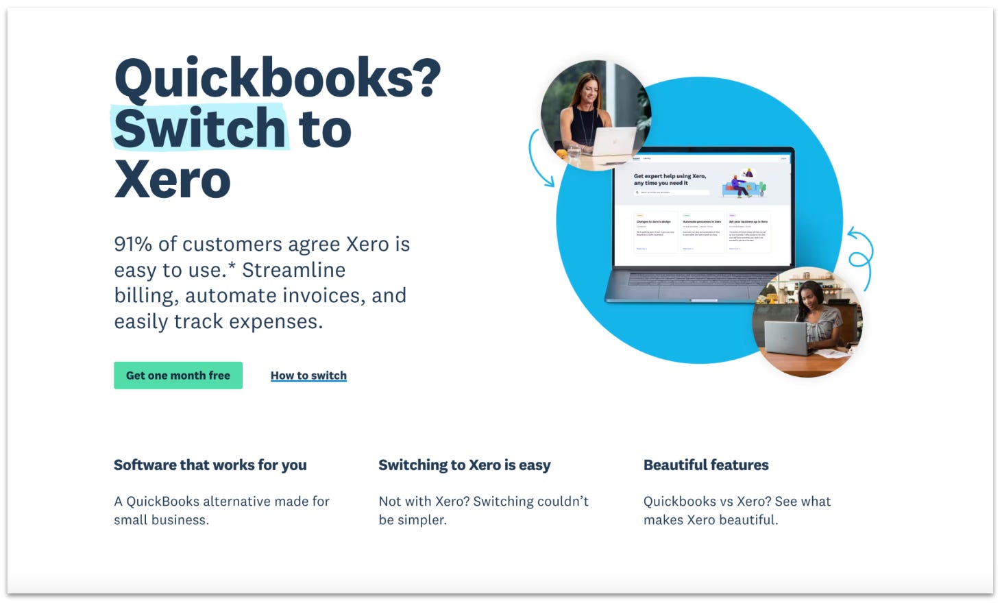
Example: Xero uses minimal text with bold, skimmable headers like “Switching to Xero is easy,” allowing users to grasp the benefits quickly.
3. Mismatched Messaging
The Problem: If your ad or email says “Free Trial,” but your landing page leads with a pricing table, you’ve broken the trust. This disconnect—called message mismatch—confuses and frustrates users.
The Fix: Align your landing page with the promise made in your ad or email. Use consistent language, visuals, and tone so users feel like they’re in the right place.
Related Research: One case study found that message match between ad and landing page can increase conversion rates by as much as 212%.3
Example: ClickUp’s ad and landing page positioning match, with both focusing on ClickUp being a superior alternative to Notion.

4. Lack of Visual Hierarchy
The Problem: Not all parts of your page are equal. If everything screams for attention, like bold fonts, competing colors, and too many calls to action (CTA), the visitor will not know where to focus.
The Fix: Design like a guide, not a billboard. Use font size, color, and white space to direct the eye. Make your main CTA button big, bold, and easy to find. Your goal is a smooth visual flow, not a chaotic collage.
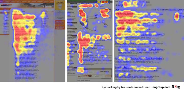
Related Research: Eye-tracking studies show that users follow an "F-pattern" when scanning content, and visual hierarchy supports faster navigation and decision-making.4
Example: Pragmatic Institute’s landing page uses a large, bold font to draw visual attention to the headline and a blue button to draw visual attention to the CTA using the f-pattern to its advantage.

5. Missing Trust Signals
The Problem: Visitors won’t convert to customers if they don’t trust you. If you’re missing testimonials, logos, reviews, or guarantees, you’re making it harder than it needs to be.
The Fix: Add proof. Testimonials from real customers. Logos of brands you’ve worked with. Data points like "10,000+ happy users" or "4.8-star rating." Even small things like a visible privacy policy, secure checkout icons, or a human photo can help.
Related Research: A study from BrightLocal found that 96% of consumers read online reviews when browing for local businesses. The same is likely true for online businesses, too.5
Example: Kit’s landing page promises a free trial with no credit card required and showcases testimonials directly below the call to action button.

6. Slow Page Load Time
The Problem: No matter how beautiful your page is, if it takes more than 3 seconds to load, many visitors will bounce before they even see it.
The Fix: Compress images, limit scripts, and use tools like PageSpeed Insights or GTmetrix to optimize load speed.
Related Research: According to Google, the probability of a visitor bouncing increases 32% as page load time increases from one second to three seconds and it gets worse the higher you go.6

Example: When we tested a pagespeed improvement at Shopify, we saw a measurable lift in conversion rate.
