

A Complete Guide to Substack Visuals
All the visuals you need to make your Substack look great and feel unmistakably you.

✨ New: The Substack Creator OS is here!
A complete Notion workspace for running and growing your Substack like a pro.
Publish more consistently with a streamlined content pipeline that eliminates chaos and guesswork.
Grow faster by turning your ideas, posts, and outreach into a clear, trackable growth system.
Increase your revenue with built-in tools for managing sponsors, products, and your paid subscriber strategy.
Right now, it’s free for Premium subscribers.
You could be the best writer on Substack, but if your newsletter looks unpolished, cluttered, or hard to read, people won’t stick around long enough to realize it.
Visuals aren’t just decoration; they’re trust signals. The right design choices make your publication feel intentional, professional, and worth subscribing to. They communicate who you are, what your newsletter is about, and why someone should care—all before they’ve read a single sentence.
The good news? You don’t need a design degree (or even Photoshop) to make your Substack look great. You just need to know what to focus on.
This guide covers every visual asset you should consider, starting with the basics, like your headshot and bio, and moving all the way up to social share images and visual formatting inside your posts. For each one, you’ll get:
What it is.
Why it matters.
Image specs.
Tips to make it easy.
Let’s make your newsletter look as good as it reads.
Substack Profile Assets
These are the visuals that represent you as the person behind the publication, because people subscribe to other people, not just content.
On Substack, your profile and your publication are technically separate. Your profile includes your headshot, handle, and bio. This is what people see when you leave a comment, get mentioned in Notes, or if someone clicks on your name. Even if your newsletter is fully branded, your author identity still shows up everywhere.

A strong, consistent personal presence goes a long way. A well-chosen headshot and a scannable bio can help build trust, recognition, and a sense of connection, before a reader even opens your first post.
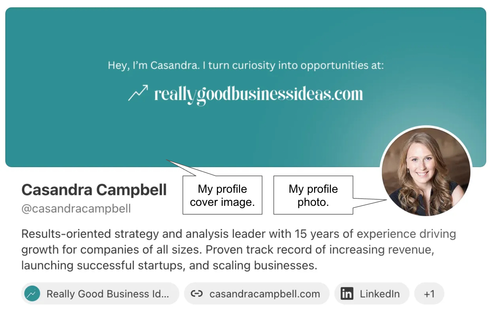
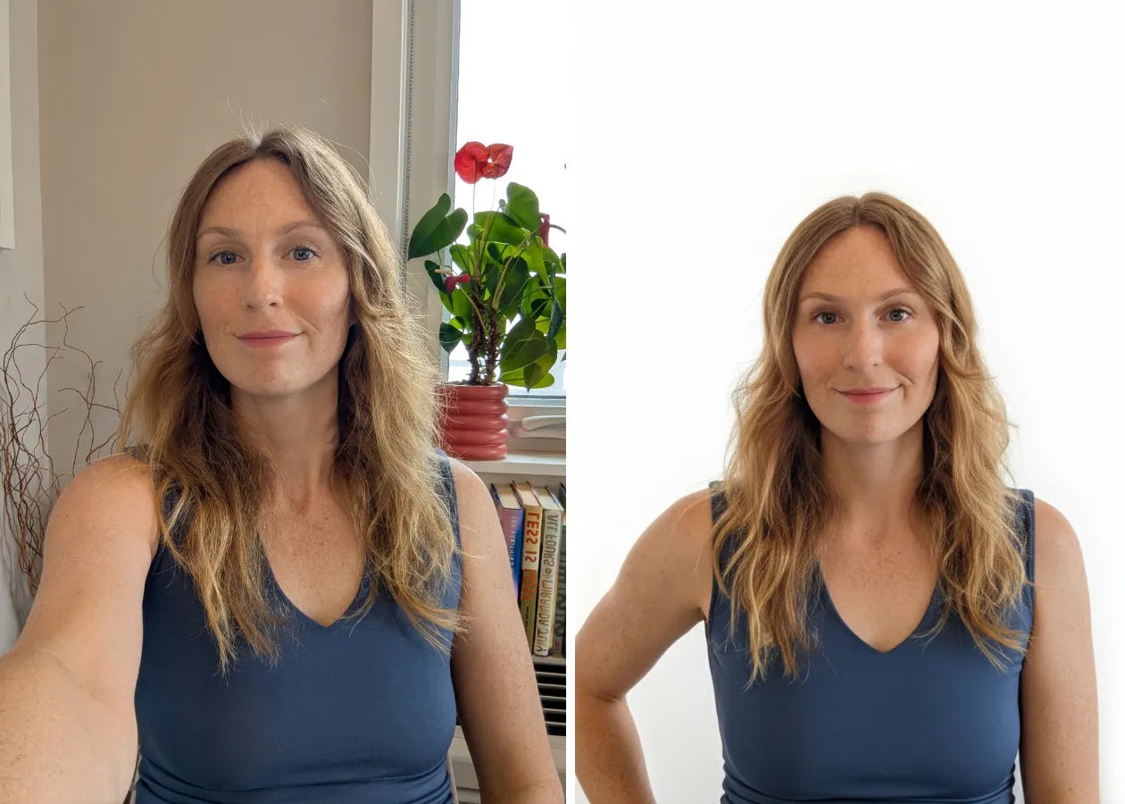
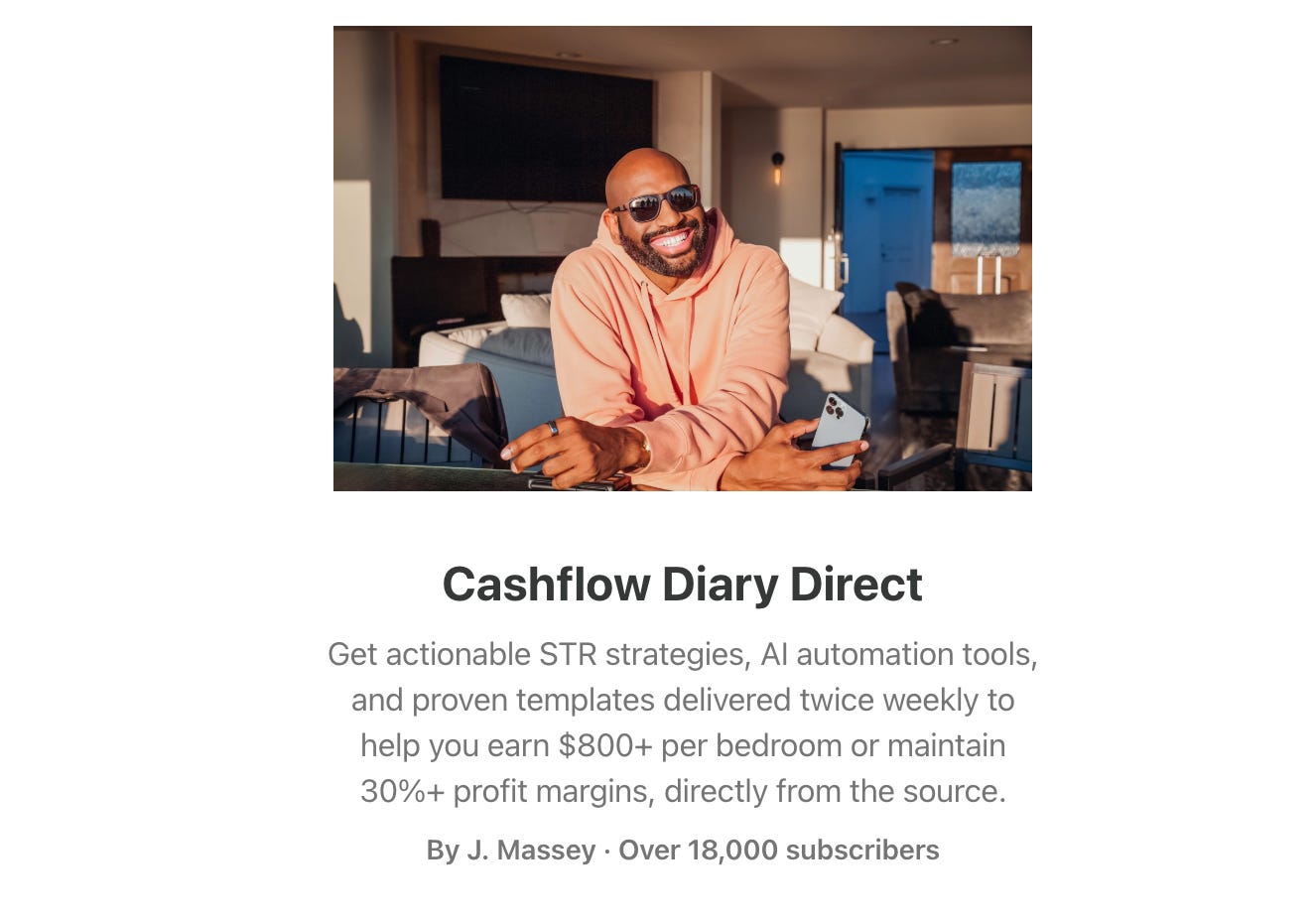
Profile Photo
What It Is: Your author photo, visible on your profile page, in Notes, in comments, and at the bottom of your posts.
Why It Matters: It makes you look real. A clear, approachable photo builds trust and signals you’re active and intentional, not just a ghostwriter behind a brand.
Specs:
File Size: Use a square, high-resolution image, at least 400 × 400 px.
File Type: JPG, PNG, WebP, AVIF, or GIF.
Tips:
Natural light and a neutral background work great.
Match the tone of your newsletter (e.g., if you write about cooking, don’t be afraid to include a photo of yourself in the kitchen or wearing an apron!).
If you don’t have a professional headshot yet, consider editing a selfie with Nano Banana. It’s really easy to do and the results can be quite good!


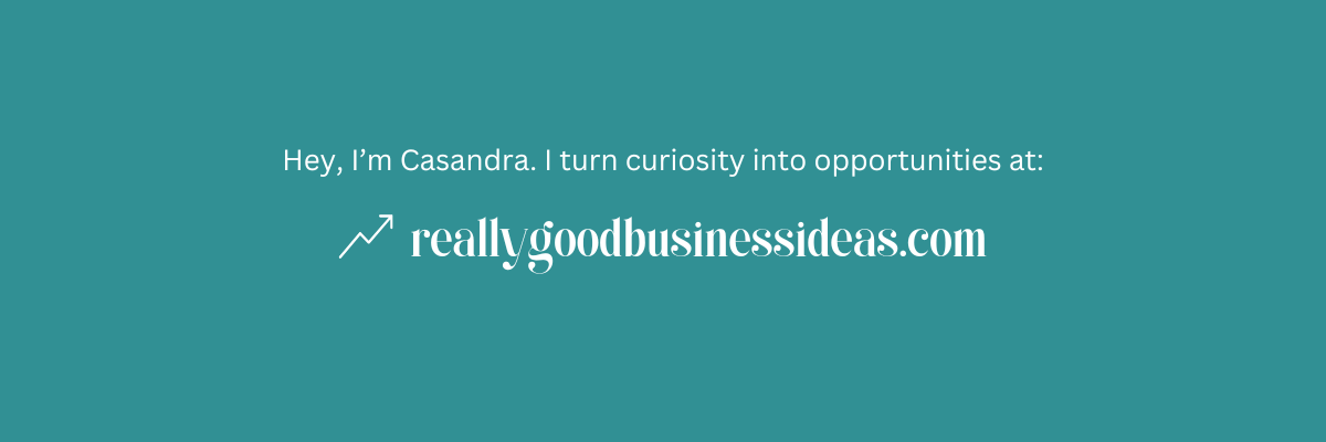
Profile Cover Image
What it is:
A horizontal image that appears at the top of your profile on Substack.
Why it matters:
It adds polish and gives your profile a branded, cohesive feel, especially if it echoes your publication’s visuals.
Specs:
File Size: Use a high-resolution image with a 3:1 aspect ratio, at least 1200 x 400 px with a max size of 64 MB.
File Type: JPG, PNG, WebP, or GIF.
Tips:
Use the same fonts and colors as your publication’s branding for consistency.
Avoid small text or busy patterns because they’ll be too hard to read on the mobile app.
Substack Bestsellers can also select an accent color and background tint when they update their cover image.
Substack Publication Assets
These visuals shape how your newsletter looks and feels as a standalone brand, on your homepage, in inboxes, and across the web.
Your Substack publication has its own identity, separate from your personal profile. These assets define how polished, professional, and cohesive your publication feels to readers—especially first-timers. Think of them as your brand’s storefront: the header, logo, colors, and favicon work together to make a strong first impression.
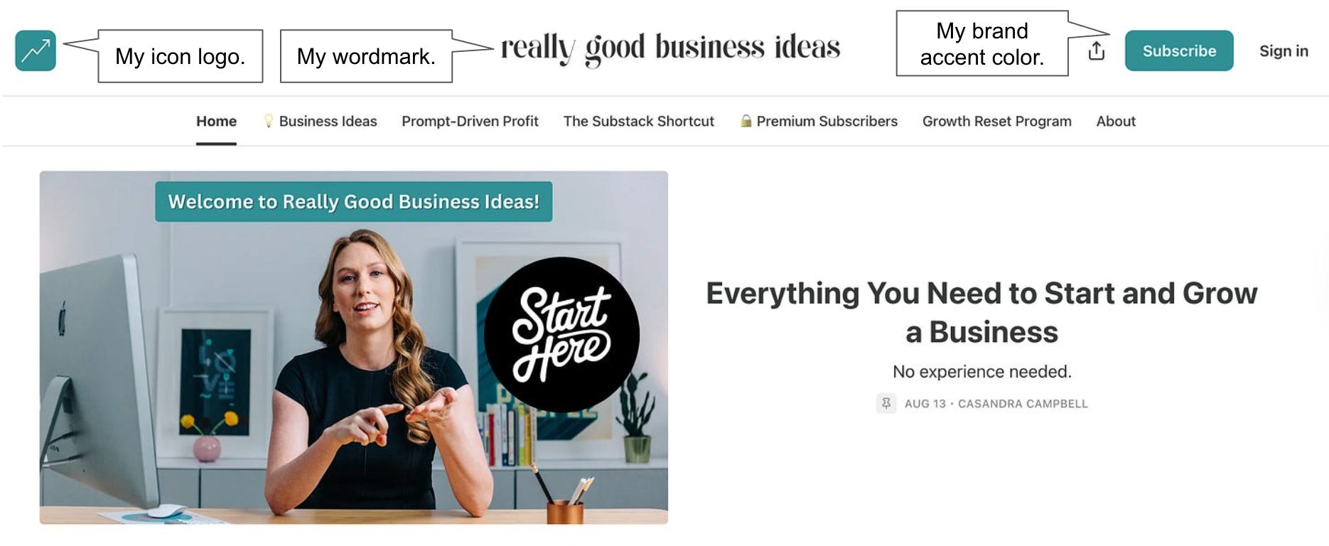
Publication Logo
What It Is: A simple, recognizable graphic that represents your brand. It could be an icon, monogram, or symbol, but it should be clear and consistent.
Why It Matters: Your logo is the anchor of your visual brand. It shows up everywhere your publication does, and a strong logo makes your newsletter feel like a real brand.
Specs:
File Size: Minimum 256 × 256p px or larger.
File Type: JPG, PNG, WebP, AVIF, or GIF.
Tips:
Design a logo that works at multiple sizes (especially small). Keep it simple: think shape, not detail.
Use a square format and a transparent background for flexibility.
No need to include your publication’s name in the logo because the name will always automatically appear along with the logo.
If you don’t have one yet, you can easily design a logo in Canva for free!
Directions for updating your publication logo on Substack.

My icon logo for Really Good Business Ideas uses a simple arrow moving “up to the right,” signifying the growth that every business chases.


Publication Wordmark (Optional)
What It Is: A stylized version of your publication’s name using a specific font, layout, or design treatment.
Why It Matters: This is often the missing piece that makes a Substack feel like a professional publication. Without a wordmark, your newsletter can look like every other default template. With one, it feels branded, intentional, and visually distinct.
Specs:
File Size: Use a high-resolution image with an aspect ratio of 21:4, at least 1344 x 256 px or larger
File Type: Use a transparent PNG.
Tips:
Choose a stylized font that is legible and represents your brand.
When combined with your icon logo, the two become a complete logo that can be used on other brand assets.
If you don’t have one yet, you can easily design a logo in Canva for free!

Brand Colors & Fonts
What It Is: The theme colors and font pairings you choose in your Substack design settings, including background color, brand accent color, heading and body copy fonts, and link style.
Why It Matters: These subtle choices shape the overall feel of your entire publication, from your homepage to your posts and every email you send. They’re part of what makes your newsletter feel cohesive instead of simply copy-pasted..
Tips:
Make sure your accent color matches one of the brand colors you’ve chosen for your logo.
Use high-contrast color combinations to ensure readability in both light and dark modes.
Select fonts that match your tone. For example, serif for a classic look, sans-serif for a modern feel, or mono for a techy feel are common.
Your logo will also be used as your favicon (the icon that appears in the browser tab when your site is loaded).
Directions for updating your brand fonts and colors in Substack.
Publication Cover Image (Optional)
What It Is: The cover image appears at the top of your publication’s welcome page, sitting just above your publication name and description. If you leave it empty, your logo will be placed here instead.
Why It Matters: This is your newsletter’s first visual impression. For many readers, it’s the difference between “this looks legit” and “is this even a real website?” A strong cover image instantly communicates tone, quality, and brand identity, before they even read a word.
Specs:
File Size: Use a high-resolution image of at least 600 x 600 px.
File Type: JPG, PNG, WebP, or AVIF.
Tips:
Use your wordmark (or a combination of logo and wordmark) as the focal point.
If you decide to use it, this is a way to communicate the vibe you want your brand to convey.
Email Banner (Optional)
What It Is: An optional banner image that appears at the top of every email your Substack sends above your post title, like a masthead.
Why It Matters: It’s the first thing readers see when they open your email. A well-designed banner gives your newsletter a polished, publication-like feel. If you’re going for a more personal letter from a friend vibe, feel free to skip it.
Specs
File Size: Substack recommends 1100 x 220 px with a transparent background, but it could also be taller.
File Type: PNG
Tips:
Incorporate your wordmark, icon logo, or brand colors to reinforce your visual identity.
Keep it clean and readable, and avoid small text or edge-to-edge clutter.
Substack Post-Level Assets
These are the visuals that show up inside your actual posts. What readers see in their inbox, on the Substack site, and when scrolling through your archive.
Well-chosen post visuals can make your newsletter feel more polished, more readable, and more engaging. They help break up text, reinforce your ideas, and give your posts a professional finish by using screenshots, illustrations, AI-generated images, or even just free stock photography.
Post Social Image
What It Is: An optional image uploaded in the post editor for each post you publish. The image shows up as the thumbnail when your post is shared on social media, featured on your homepage, or previewed in the inbox.
Why It Matters: This is the first visual impression of your post. It’s what shows up in social media feeds like Twitter, LinkedIn, and Substack Notes. A strong preview image can stop the scroll and increase clicks, shares, and open rates.
Specs:
File Size: Use a high-resolution image with an aspect ratio of 14:10 (at least 1456 x 1048 px is ideal).
File Type: JPG, PNG, WebP, AVIF, or GIF.
Tips:
If you don’t upload a social image, the first image in your post will get used instead, but I recommend making a conscious choice about whether that image will work well or if you should create something different.
Many publishers prefer to use a consistent color or style to reinforce their brand; others like to experiment with different ways of capturing attention and standing out in social feeds.
Be aware that the image may be cropped differently on different social networks and devices. Try to keep text centered so it doesn’t get cropped, or avoid text entirely.
Directions for uploading a social preview image in your Substack posts.
In-Post Visuals
What It Is: Any images you embed directly into the body of your posts: screenshots, charts, illustrations, memes, product shots, etc.
Why It Matters: These visuals break up walls of text, add context, and make your post more engaging and memorable. Used well, they can also help explain complex ideas or reinforce your tone and personality.
Specs:
File Size: Use the highest-quality version of the image you have, in any size.
File Type: JPG, PNG, WebP, AVIF, or GIF.
Tips:
Make sure you properly source images when appropriate, and consider adding alt text for people who use screen readers.
If you use screenshots, consider light annotation (circles, arrows) for added clarity.
Have fun and be creative! This is a great way to enhance the reading experience.


Substack Image Specs
Here’s a quick reference summary of all the recommended image sizes and allowable file types across Substack visual assets. If you’re not sure which filetype to use, go with PNG since it works for everything on the list.
You don’t need a design degree to make your Substack look great. You just need a few well-chosen visual assets. Ones that align with your tone, reflect your brand, and stay consistent from post to post.
Start with the basics: a clean headshot, a strong logo or wordmark, and social post images that look good on both desktop and mobile. From there, layer in headers, banners, and brand colors to your newsletter to life.
The goal isn’t perfection. It’s clarity, trust, and a visual identity that makes your readers feel like they’re in the right place. Remember, you can keep improving as you go!
A Strong Visual Brand Starts With Strong Positioning.
If you want help refining your own positioning so you can build out your visual brand, I created a step-by-step worksheet to walk you through it.
Inside, you’ll get:
A simple 4-question framework to uncover your niche.
Tips to avoid common positioning mistakes.
A plug-and-play sentence formula to describe your newsletter clearly.
Real examples to guide your own.
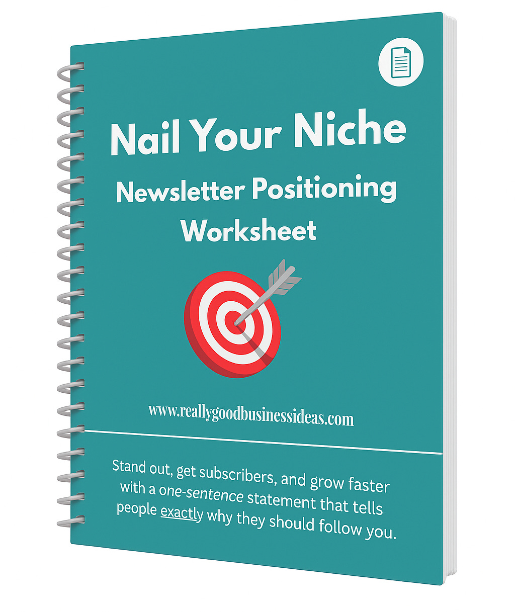
By the end, you’ll have a strong niche where you can thrive and a one-sentence positioning statement you can use to build out your brand.
This resource is available to Really Good Business Ideas Premium subscribers in the Really Good Resource Library.
Premium members also get access to office hours, where you can get one-on-one feedback and guidance from me directly.
Upgrade to access the worksheet and start sharpening your positioning today.
To endless possibilities,
Casandra
💬 What’s the best visual brand you’ve seen on Substack? Share your favorite in the comments!
Thank you! I didn’t even realised we had a profile banner!
This is spot on. Readers make a judgment in seconds, and design is often the first signal of quality and trust. Even the strongest writing can be overlooked if the presentation feels cluttered or unfinished. I appreciate how you break it down into simple, doable steps. It makes design feel less intimidating and more like part of the craft of publishing.