


One of the strangest parts about publishing a newsletter is the imbalance between how much your readers know about you and how much you know about them. Your audience hears from you every week. Over time, they get to know how you think, the experiences that shaped your point of view, and your likes and dislikes. But while you’ll often get to know a few more outspoken or loyal readers, you’ll likely never hear from most.
You can infer a bit about what your audience likes and dislikes from your post stats, but they only take you so far. To really start to understand your audience, you need to look at your publication stats. While they won’t tell you everything, they will help you understand your audience better and whether your publication is as healthy as it looks from the outside.
The Stats tab is where you go to understand how your publication is performing as a whole, rather than post by post. It has a lot of tabs, so here’s a breakdown of what each one shows.
What Are Substack Publication Stats?
Substack publication stats provide data on your entire publication, revealing who your audience is, how they found you, and how they engage with your publication.
While post stats help you optimize individual pieces of content, publication stats let you step back and see the bigger picture. They help identify patterns not visible from single posts, prompt questions about audience needs, and support strategic decisions for your publication's future, beyond just optimizing your next post.
How to Access Substack Publication Stats
To access your Substack publication metrics, navigate to the “Stats” tab in your publication’s dashboard.
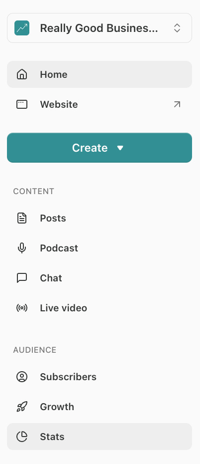
You’ll land on the Stats page with eleven different tabs to help you understand your audience and your publication’s performance.

Each Substack Publication Stat Explained
Below is a breakdown of every metric across all eleven tabs, what each one means, how it’s calculated, and how to actually use it.
Network
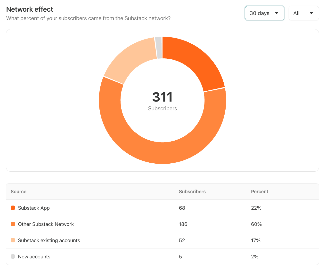
What It Means: The Network tab breaks down how your subscribers found you relative to Substack’s network. Here’s how Substack describes each category:1
Substack app: Readers who directly subscribed from a Substack platform surface such as the Substack app, Notes, or the leaderboards.
Other Substack network: Readers who subscribed as a direct result of Substack network features such as Recommendations and promotions.
Substack saved credit cards: Readers who could subscribe to your publication in only one click because they already had a payment method on file with Substack.
Substack existing accounts: Readers who could more easily subscribe to your publication because they already had a Substack account.
Imported accounts: Readers who you imported.
New accounts: Readers who came directly to your publication.
How to Use It: This tab is more for Substack’s benefit than yours. Substack is very generous with giving itself credit here. I once texted a friend my publication link directly, and when she subscribed, Substack counted her as a network-driven subscriber. It makes their network look more powerful, but it doesn’t give you anything useful to act on.
Audience
The Audience tab includes three metrics to help you understand your broader audience on Substack: Total followers, Audience location, Audience overlap.
Total Followers
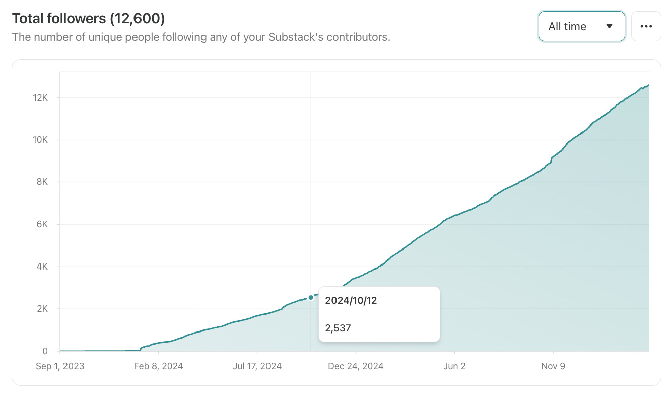
What It Means: Followers are people who follow you on Substack without subscribing to your emails, which is a lighter-touch way to keep up with a publication. However, the “Total Followers” metric combines both subscribers and followers who don’t subscribe. This section shows the cumulative growth of your total follower count over time.
How to Use It: This metric isn’t particularly useful, but it’s a good reminder to post Notes to reach the people who aren’t getting your emails.
Audience Location
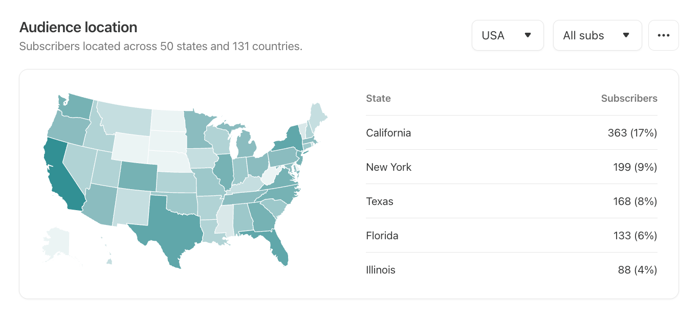
What It Means: Audience location shows where your subscribers are based and can be filtered to include all subscribers or only paid subscribers.
How to Use It: Knowing where your readers are based can inform your topic selection and even whether certain publication sections make sense for your publication. For example, I wouldn’t have written about my US-based financial tech stack if I didn’t know a large portion of my audience was in the US.
Audience Overlap
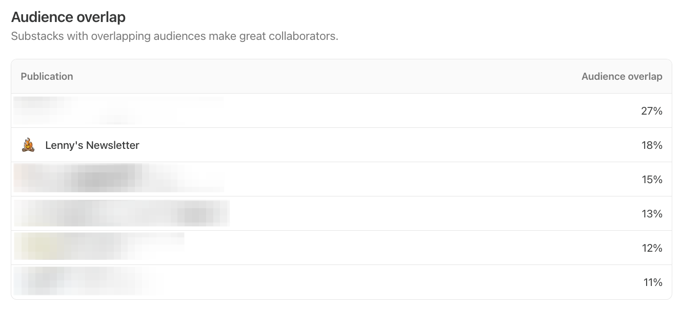
What It Means: Audience overlap shows which other Substack publications your subscribers also subscribe to, as well as the percentage of your audience that subscribes to each one.
How to Use It: Audience overlap gives you a window into who your readers actually are. For example, 18% of my audience also subscribes to Lenny’s Newsletter, which suggests I likely have many tech workers in my audience. Audience overlap is also useful for finding publications to collaborate with, since readers who don’t already subscribe to you are likely to be interested in what you publish. You’ll often spot the publications that recommend you here, too.
Retention
The Retention tab includes three metrics to help you understand your broader audience on Substack: Paid net growth, Paid cohort analysis, Paid churn.
Paid Net Growth
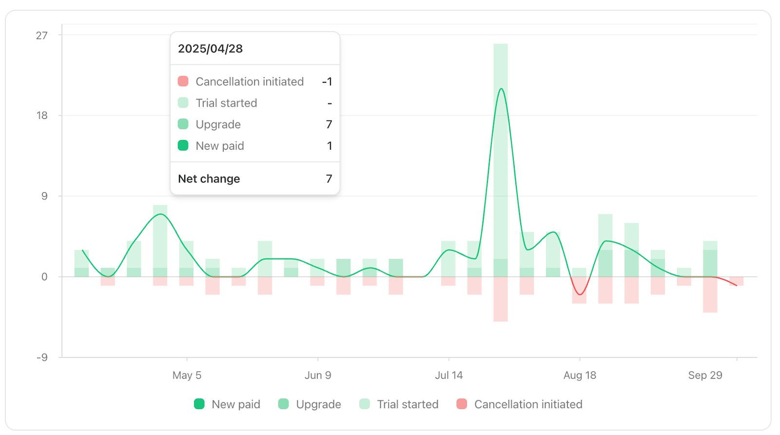
What It Means: At the top of the Retention tab you’ll see three summary numbers: your 30-day paid growth rate, the number of new paid subscribers in the last 30 days, and the number of paid cancellations in the last 30 days. Below that, the paid net growth chart shows new paid subscriptions versus cancellations initiated over time. You can hover over each data point to see the breakdown of free upgrades to paid, new paid subscribers, trials started, and cancellations initiated. Comped and group subscriptions are excluded.
How to Use It: This is the clearest view of whether your paid subscriber base is actually growing. If you’re adding subscribers but also seeing a high cancellation rate, your growth may be masking a retention problem. A spike in cancellations right after a newsletter send is common and not always cause for concern, but a consistent upward trend is worth digging into.
Paid Cohort Analysis
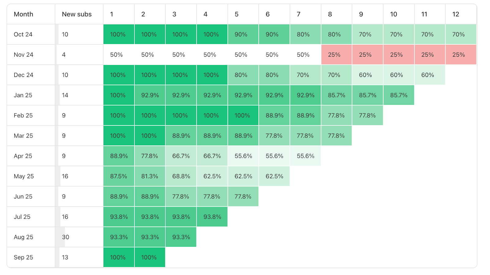
What It Means: Paid cohort analysis shows two things. At the top, you’ll see overall retention rates at 1 month, 6 months, and 12 months. Below that is a detailed table that breaks this down by the month each subscriber joined, showing what percentage of that group is still subscribed after each subsequent month. Gifted and comped subscriptions are excluded. Expect a sharper drop at the 12-month mark as annual subscribers hit their renewal date.
How to Use It: This is one of the most useful views in the whole dashboard if you have paid subscribers. Reading across the rows tells you how well you retain subscribers over time. Reading down the columns tells you whether newer subscribers are sticking around at a higher or lower rate than older ones. If retention is improving with newer cohorts, something you’re doing is working. If it’s declining, that’s worth investigating before it compounds.
Paid Churn
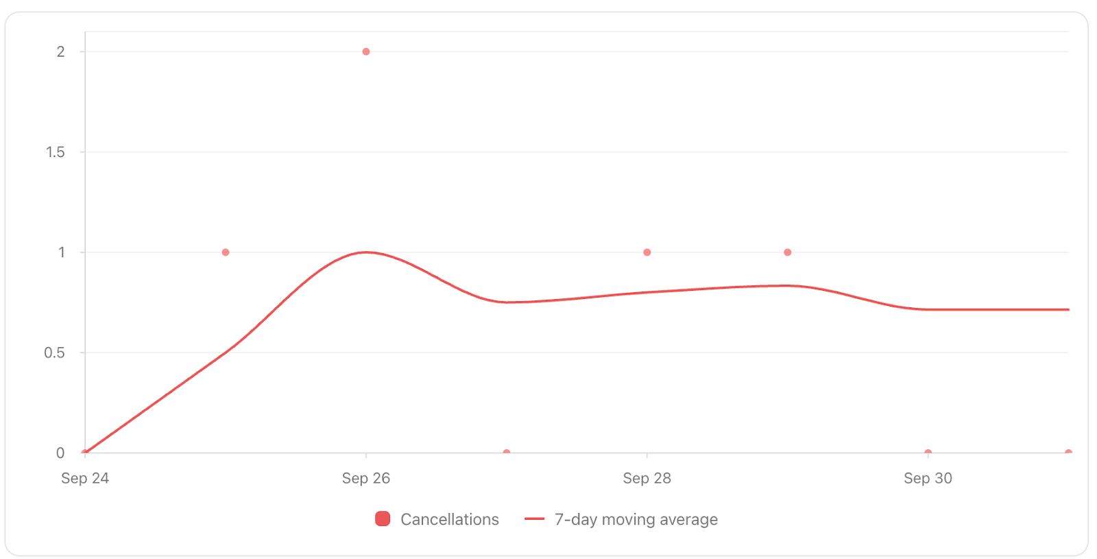
What It Means: Paid churn shows the number of paid subscribers who initiate cancellations each day, plotted against a 7-day moving average. Note that a cancellation initiated is not the same as a subscription expiring. A subscriber who cancels in June but paid for an annual plan in January retains access until January and remains counted as a paying subscriber until then.
How to Use It: Watch the 7-day moving average rather than individual daily spikes, which can be noisy. A gradual upward trend in the average is a more meaningful signal than a single bad day. Spikes after newsletter sends are normal. Persistent elevated churn usually points to a content or value problem worth addressing.
Sharing
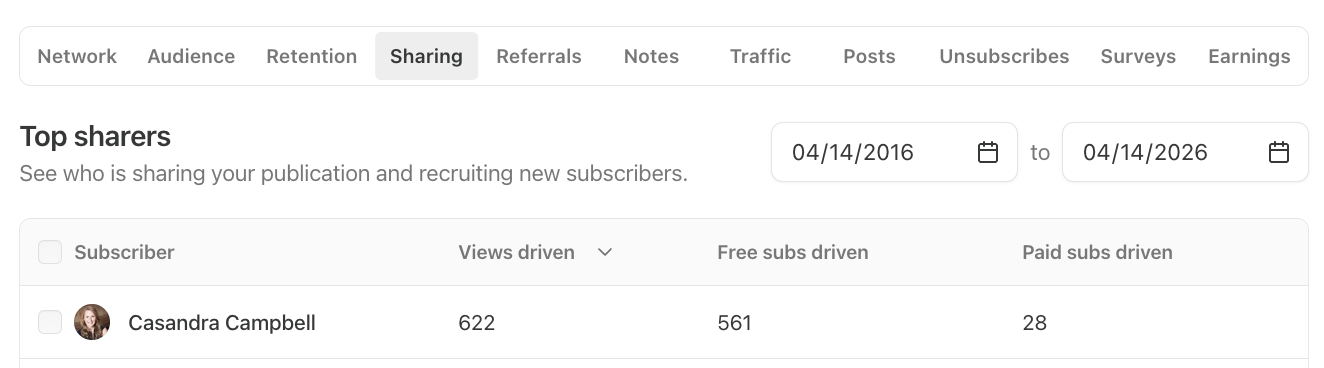
What It Means: The Sharing tab shows which subscribers are sharing your posts and how many visitors, free subscriptions, and paid subscriptions their shares generate.
How to Use It: If you notice certain subscribers consistently driving new signups through their shares, they may be good candidates for a collaboration. At minimum, it’s a good reason to reach out and say thank you. And if you don’t see your own name at the top of this list, you’re probably not sharing your posts enough!
Referrals

What It Means: The Referrals tab tracks gifted subscriptions. It shows how many gifts were sent, how many were accepted, and how many of those gift recipients converted to paid subscribers. The top referrers table breaks this down by individual subscriber so you can see who is sending gifts on your behalf.
How to Use It: If someone is consistently gifting your publication to others, they are worth reaching out to thank and potentially collaborate with.
Notes
The Notes tab doesn’t contain any stats, and it doesn’t have anything to do with Substack Notes, but it does contain notes written directly to you by paid subscribers. These notes provide a lovely window into why people upgraded their subscriptions and can also be used as testimonials.
Traffic
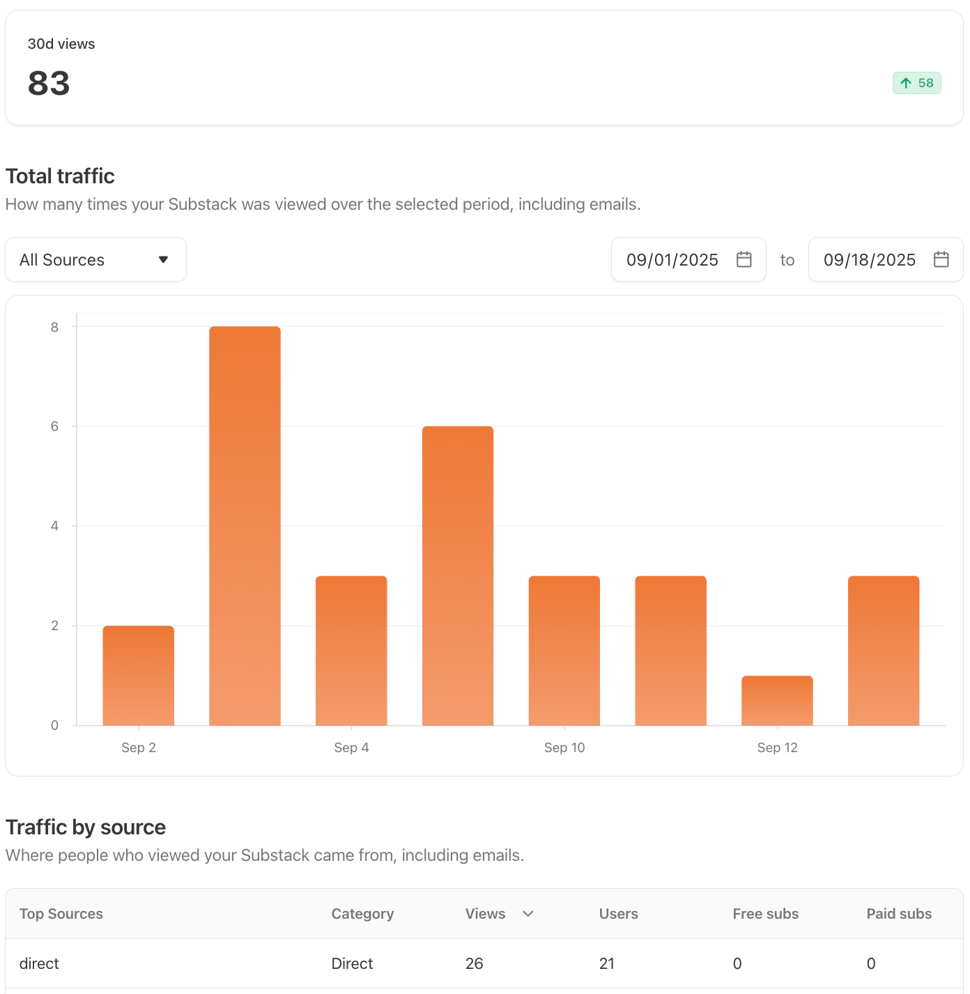
What It Means: The Traffic tab shows how many times your Substack was viewed over a selected time period, including email opens. At the top you’ll see your total views for the last 30 days. Below that, the traffic-by-source table breaks down views, users, free subscriptions, and paid subscriptions by source.
How to Use It: The total views number includes email opens, so it will always look higher than your actual web traffic. The more useful part of this tab is the traffic by source table. It tells you not just where your views are coming from, but which sources are actually converting to subscribers. A source driving a lot of views but no subscriptions is worth noting. If you’re serious about understanding your traffic and growth, Google Analytics gives you a much deeper picture than Substack’s native reporting.

Unlock Better Insights: How to Use Google Analytics to Understand Your Substack Traffic (For Free!)
Posts

What It Means: The Posts tab gives you a summary table of post stats for every article you’ve published, including views, engagement rate, free subscriptions, paid subscriptions, estimated value, and open rate. At the top, you’ll see your 30-day open rate across all posts. You can sort the table by any column and filter by date range, audience, and other criteria.
How to Use It: This is one of the most useful tabs in your dashboard because it lets you compare performance across all your posts in one place. Sorting by free subscriptions or paid subscriptions tells you which content is actually driving list growth. Sorting by engagement rate tells you what your existing audience finds most interesting. Those are often two different posts, and both are worth knowing.
Unsubscribes
The Unsubscribes tab helps you understand when paid subscribers are canceling their plans and why.
Unsubscribe Feedback
What It Means: The Unsubscribes tab shows feedback from paid subscribers who canceled, broken down by reason: price, time, autorenew, or other. You can see the breakdown in a chart over time and a table with individual cancellations, including the subscriber’s email, their stated reason, and any feedback they left.
How to Use It: This tab is only visible if you have paid subscriptions enabled. Don’t obsess over individual responses, as people often pick whatever feels least confrontational. Instead, check in occasionally to look for common themes. If price keeps coming up consistently, you may need to reconsider your Substack pricing or add more paid benefits at your current price point. If time is the dominant reason, the problem is more likely content relevance.
Surveys

The Surveys tab doesn’t contain any publication metrics, but it can help you understand your audience better. If you run any audience surveys, your survey results will all be accessible here.
Earnings

Consider the Earnings tab a placeholder for now. This newer tab is supposed to show your publication's actual earnings (paid out by Stripe), but mine is currently empty, and I’m guessing yours is, too. Hopefully, we’ll start to see data populating here soon.
Put Your Publication Stats to Work
Substack’s publication stats give you a view of your newsletter that individual post stats can’t. From understanding who your audience is to spotting trends in your growth and retention, this is where the bigger picture comes into focus.
I’ll be covering the remaining Substack metrics next week. Make sure you’re subscribed so you don’t miss it.
To endless possibilities,
Casandra
Need More Help?
Really Good Business Ideas Premium: A membership designed to make starting and growing a profitable business easier. Full archive access, DM support, and a library of templates and resources.
Substack Creator OS: A complete operating system for planning, writing, growing, and monetizing your newsletter, all in one connected Notion workspace. (Right now, it’s free for Premium subscribers).
Work With Me Directly: Book a 1-on-1 consultation or coaching call to get personalized help when you need it. Think of it as a focused working session to get unstuck, gain clarity, or move something forward.

Sorting by free subscriptions versus engagement rate to reveal two completely different lists is something I have never thought to separate. I have been treating high engagement as a proxy for growth, but those are measuring two different things entirely. What I have found is that the posts readers love most and the posts that actually grow the list rarely overlap, and conflating the two leads to optimizing for the wrong outcome. You are building something genuinely useful here. The practitioners in your audience are going to carry this one for a while.
This was very insightful. I’m still at the stage where I’m barely a month in and still trying to figure out what direction to go in but once I settle, I can understand this better and know what adjustments I need to make to make my substack better. Saving this post!
Also, looking at stats can be intimidating because if you get fixated on numbers then it could be paralyzing. It’s important to find a balance between gaining information to help improve and not think of yourself as a failure.